A landing page is the first page a visitor sees when they visit your website. This page will vary based on where they came from – a search result, clicking on a paid ad, social media posts, etc. Mastering landing page optimization is the key to growing your audience and customer base.
An optimized landing page is a valuable resource that you can customize to your needs. When used the right way, a landing page can improve the chances of conversion, lead to increased sales, and enhance lead generation.
With this guide, you will learn why optimization is important and explore some quick steps you can take to improve your landing page optimization.
Key Takeaways
- Landing page optimization is crucial to improving your conversion rate.
- Landing pages should be straightforward with a clear, direct CTA.
- A/B testing can help improve the overall performance of your landing pages.
- Customer reviews and testimonials add social proof to your landing pages.
Why Landing Page Optimization Matters
An optimized landing page delivers relevant information to the user based on what they clicked on to get there. For example, if they searched for certain keywords in a Google search and one of your landing pages was a top result, that user should see relevant information on your page after clicking on the search results.
If someone can’t find the information they are looking for, they won’t hesitate to abandon your page and continue their search. You have about 3-5 seconds to catch their attention and convince them to keep reading.
The best landing pages are visually appealing and have high conversion rates. This is the percentage of visitors who fulfill the call-to-action (CTA).
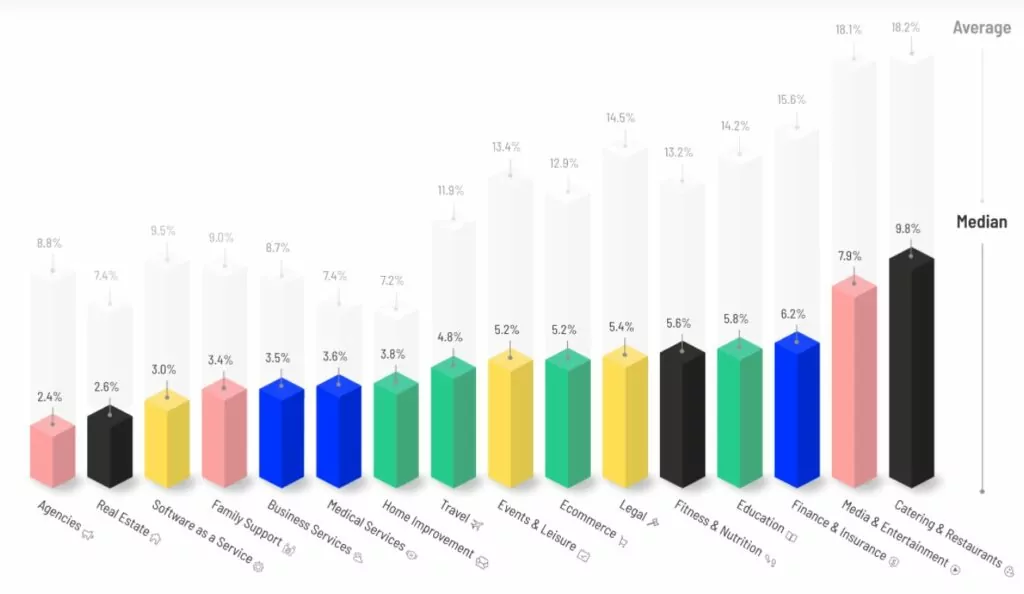
According to the 2021 Conversion Benchmark Report, conversion rates vary greatly by industry. Across 16 industries, the average median conversion rate is about 4.6%.
Source: Unbounce
Create an Optimized Landing Page with These 7 Tips
The goal of landing page optimization is to uncover any problems with your page and fix them. Optimization usually includes strategic testing and experimentation to determine how each change affects the conversion rate.
Here are some of the best tips for optimizing your landing pages.
1. Limit the Available Actions on the Page
Too many options on a landing page may decrease your conversion rate. Consider removing fields in the CTA form, eliminating website navigation buttons, and getting rid of any distracting images.
Your CTA needs to be the primary focus of any landing page. It might be surprising how effective an uncluttered, clean page with empty space can be.
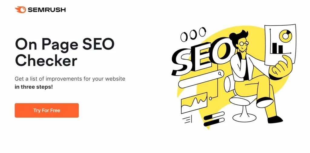
For example, look at this landing page from Semrush. Except for the logo, there are no other navigation options, and the CTA is clearly presented at the top of the page. The messaging stands out from the surrounding white space.
Source: SEMRUSH
2. Put the Most Important Information Above the Fold
This newspaper term still applies to website design. Put the most important information at the top of the page. If someone has to scroll to find the CTA, it’s in the wrong place. You want your attention-grabbing headline, a couple of sentences of copy, the CTA, and a simple graphic to all be instantly visible when someone lands on that page.
Optimizing this design can be a bit more challenging since so many people use smartphones to browse the web. A scroll map tool can quickly show you where the typical “fold” would fall on most devices so you can optimize for mobile and desktop uses.
3. Add Some FOMO
FOMO, or the fear of missing out, can be a powerful psychological tool. The idea of not getting something that you want can compel some people to act quickly.
Add that FOMO by using words and phrases that imply scarcity. Retailers do this by telling shoppers how many of a certain item there are left. You could offer a “limited time” discount or a countdown clock to register for your next live webinar.
4. Use a Simple CTA
Your call-to-action button or headline should be clear and direct. Include a straightforward message, so the reader knows exactly what you want them to do. Some good examples include:
- Sign Up for Free
- Join Now
- Contact Us
- Download Now
- Schedule Your Free Consultation
- Subscribe
- Don’t Miss Out
There are ways to make a CTA unique by using words relevant to your business. For example, Uber uses a CTA button that says, “Sign up to drive.”
5. Do A/B Testing
You want your landing pages to convert as many readers as possible. You need simple yet convincing language and a clean graphic design. However, it can be hard to predict what will work best. To create the ideal page, you should do A/B testing using various headlines, layouts, and CTA buttons. Change one feature at a time to see which option performs best.
This video walks you through some of the layouts you can try when building a landing page.
6. Use Reviews and Testimonials
One of the most powerful tools on the internet is an online review. This social proof is what most people are looking for on the internet. They want to make sure that a business is trustworthy and offers good products and services. Nearly all internet users read reviews. One study showed that 98% of people read online reviews before visiting local businesses.
On a landing page, you could include a section beneath the CTA with some of your best reviews and testimonials. A header like “Read what others are saying about us” can draw attention to these reviews.
7. Stay Consistent
Your landing pages should match your brand messaging and imagery used in other locations. This is particularly important for landing pages triggered by banner ads. You should have similar language and visuals on both the ads and landing pages.
Improve Your Optimization Using MXTR
Designing and optimizing landing pages takes time and skill. If your business lacks the experience needed to improve your conversion rates, you need an expert partner on your side.
At MXTR, we specialize in helping franchise businesses and multi-location brands with their marketing needs. This includes lead management, marketing automation, and digital marketing strategies. Our team of marketing specialists will work with your brand to create marketing campaigns and landing pages that will drive revenue and increase conversions.
Are you ready to accelerate your business growth? Schedule a free demo with MXTR today.
Featured Image: istockphoto


